How to Let Your Team See Profit Key Data Related to Tobacco Content Every Day
At 9 AM on October 8, 2024, I wrote three lines on the whiteboard of a co-working studio in Hangzhou Binjiang, with editors, operators, and part-time customer service sitting beside me. The previous day was the first workday after the National Day holiday. I roughly calculated September's accounts from the store and private domain backend: **GMV for the month was about RMB 116,000. The books "looked profitable," but after deducting platform fees, returns, advertising spend, and outsourced editing costs by my own formula, the net contribution was only around RMB 18,000** — yet for an entire week in mid-September, the team was still celebrating an oral comparison video that broke 600,000 views.
That week, content staff watched plays, operations tracked group join numbers, customer service monitored inquiry volume, and I tracked end-of-month total profit. **Four sets of numbers, four types of emotions — none of them could tell you on the same day: is money sliding downward?**
The conversion chain for tobacco-related content (more precisely, smoking cessation, oral health, and compliant harm reductionpopular science content on this side) is long and fragmented. You can't wait until finance sends the spreadsheet to find out which column is losing money. This article is about how I compressed "profit" from an end-of-month result into a simple dashboard that **someone opens every day, someone fills every day, and people can argue over every day** — not an enterprise-grade big screen, but an operating system that a 2–10 person small team can sustain.
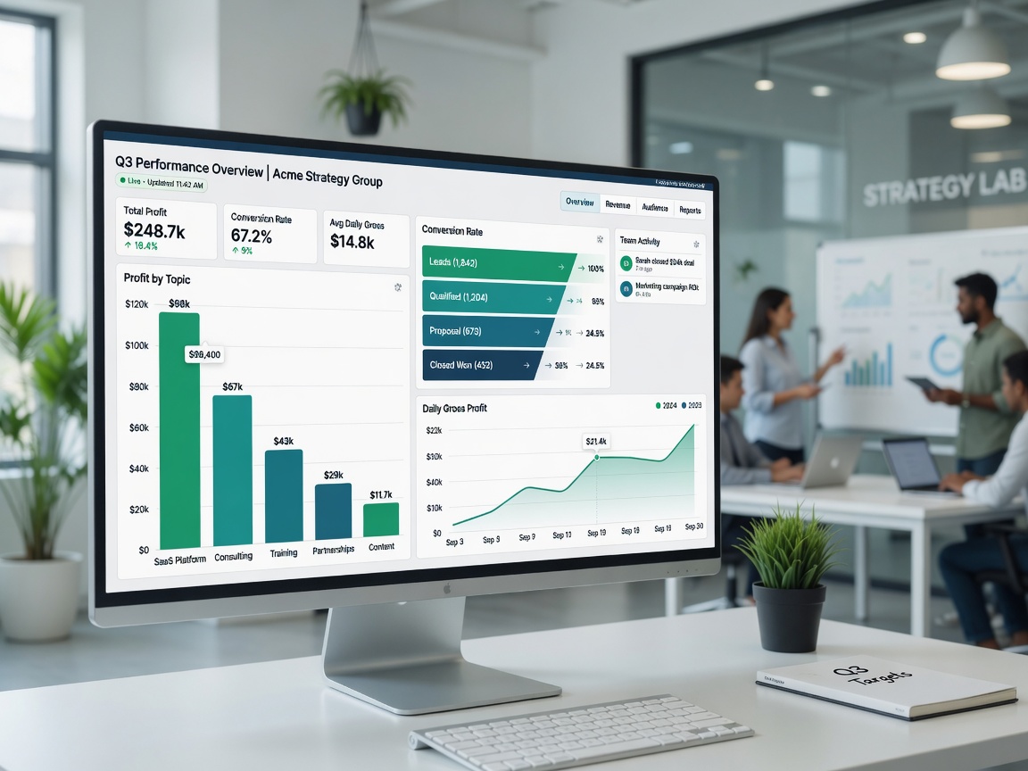
I. Why Tobacco Content Teams Are Especially Prone to "Discovering Losses at Month-End"
Let me state my position first: I oppose teams setting KPI targets as plays, likes, or net follower growth. These can be process signals, **but they cannot serve as proxy variables for profit.**
There are four reasons, all from my bookkeeping records from late 2023 to the first half of 2025 — not theoretical deductions.
**1. The conversion chain spans weeks or even months.**
Users often first read hazardpopular science content, a few days later search for "oral changes on day 7 after quitting smoking," and another week later add a contact or purchase a mini-course. Money lands in the private domain or on consultation orders, but the person who produced thatpopular science content only sees "plays are okay, conversions are not good." Without a unified dashboard, contributions are fragmented, and decisions become biased.
**2. Gross profit varies enormously between topics.**
For the same 10,000 plays, apopular science content long article might only bring a few saves; a smoking cessation timeline column might bring 8–15 valid private messages; a certain type of limited-time live Q&A might directly contribute several thousand in gross profit. When I broke down accounts by topic in August 2024, one column contributed about 14% of total site plays but captured nearly 37% of profit — you can't see this structure with daily numbers alone.
**3. Compliance issues and refunds can suddenly eat profits.**
Advertising and product sales restrictions for tobacco and e-cigarette directions are strict. Once content crosses the line, comment sections spark controversy, or platforms impose traffic limits, advertising ROI can change overnight. Refunds, customer complaints, and the labor cost of repeated consultations rarely enter "content data weekly reports." **Costs that don't enter the dashboard ultimately appear as "how is there no money this month."**
**4. The backends each role sees are fragmented.**
Douyin Creator Center, Video Account Assistant, Shop, Enterprise WeChat, Forms, Feishu Documents — every tool tells the truth, but only the local truth. The consensus on operational dashboards in the industry is simple: metrics must serve decisions, one screen only answers a few questions, layered for different roles; content marketing emphasizes linking content performance with revenue attribution and fixing the review rhythm. I used these principles but deliberately chose the simplest tools.
II. The Dashboard First Answers Questions, Then Selects Metrics
At that whiteboard meeting in October 2024, I allowed the dashboard homepage to answer only five questions:
1. Yesterday/this week, **what is the real gross profit on the books?** (Not GMV)
2. Where does the money mainly come from — **which 2–3 topics/columns?**
3. Where is the funnel blocked: plays → private domain → valid consultation → transaction?
4. Are customer acquisition and content costs **eating into gross profit?**
5. Are there any compliance or complaint **red flags** that must be handled today?
All other metrics go into detailed tables. The common pitfall in industry KPI dashboards is stacking metrics from "available data fields" rather than working backward from "what decision needs to be made today." We did the opposite: **if a field has no decision use, it doesn't go on the homepage.**
Here's how I layered it:
| Role | What They See Daily (Homepage) | What They Drill Into Weekly |
|---|---|---|
| Lead/Boss | Gross profit, Topic Top 3, cumulative ad spend, refund rate | Topic contribution, cash safety cushion |
| Content | 7-day valid private domain entries per column, completion/interaction only as auxiliary | Single-item anomalies, whether to stop a topic |
| Operations | Channel code inbound, conversion rate, promo code attributed orders | Ad ROI, material consumption |
| Customer Service/Delivery | Pending replies, pre-transaction consultation duration, refund reason tags | Negative reviews and repurchase leads |
All three roles can finish reading one screen in under 3 minutes. If it takes longer, the dashboard will die.
III. Metrics That Must Be Tracked Daily: Lock the Definitions, Otherwise It's Useless
The following set is what I actually ran and solidified in 2024 Q4. You can scale the numbers to your size, **but don't let the definitions drift.**
### 3.1 Profit Layer (Track Trends Daily, Reconcile Weekly)
| Metric | Definition (Write into Table Header Notes) | My Daily/Weekly Focus |
|---|---|---|
| Current day / last 7 days gross profit | Revenue − refunds − platform deductions − attributable ad spend − attributable outsourced content costs | Rolling 7-day view; daily volatility is high, don't fixate on single-day emotions |
| Topic gross profit share | Gross profit attributed by promo code/channel code/note topic code / total gross profit | Homepage only shows Top 3 + "Others" |
| Refund amount and refund rate | Refunds / revenue (same window) | Yellow at 8%, Red at 12% (empirical thresholds at our scale) |
Note: **Platform traffic incentives and creation subsidies go in a separate column, not merged into "content topic gross profit."** In September 2024, we once included subsidies in column profit, and the content team immediately chased "easy incentive topics," skewing gross profit.
### 3.2 Funnel Layer (Track Bottlenecks Daily)
For tobacco/smoking cessation accounts, I enforced four unified stages:
1. **Exposure and effective reading**: plays or reading UV; effective reading can be defined as completion ratereaching the threshold or dwell time exceeding a threshold (set your own number and lock it).
2. **Inbound**: private messages + channel code WeChat adds + form submissions, **coded by topic**.
3. **Valid consultation**: customer service marks "has specific smoking cessation/oral/harm reduction related questions and can be followed up," excluding arguments and pure trolling.
4. **Transaction**: paid and not fully refunded within thestatistical window.
Daily tracking focuses on three conversion rates:
- Effective reading → Inbound
- Inbound → Valid consultation
- Valid consultation → Transaction
One week in November 2024, plays looked great, but the inbound rate dropped from about 1.2% to 0.4%. The dashboard turned red, and we reviewed the comments section the same day: the title promised too much, trust was overdrawn. If we only looked at plays, we'd have concluded "content is very successful."
### 3.3 Cost Layer (Prevent "Losing Money While Looking Busy")
- **Ad spend** (feed ads/boosting, attributed to topic where possible)
- **Direct content costs** (outsourced copywriting,materials, on-camera labor; in-house staff can be roughly allocated as "hours × agreed hourly rate")
- **Customer serviceoccupancy** (optional: valid consultation count × average processing minutes, used to flag delivery bottlenecks)
My requirement: **any column that "looks like it's growing" must also answer "what is the cost per valid inquiry."** Topics with expensive inbound rates, even if completion rates look good, should be deprioritized.
### 3.4 Compliance and Risk Layer (Profit Dashboard Must Have Fuses)
Tobacco content is not a regular beauty account. In the top right corner of the homepage, I placed three lights:
- **Review/traffic limit events** (none / warning / restricted)
- **High-risk comment rate** (inducing minors, prohibited efficacy claims, off-platformviolation transaction leads — counted by customer service marks)
- **Negative reviews and complaints** (linked with refunds)
Once in January 2025, a product comparison article's comment section started showingviolation traffic diversion phrases like "where can I buy ××." Without risk lights on the dashboard, operations might still be celebrating inbound growth. We turned off comment keywords that day, changed the pinned explanation, and paused similar topics — **protect the account first, then talk about profit visualization.**
IV. Minimum Viable Dashboard: Spreadsheets First, BI Later
I deliberately avoided jumping to enterprise BI. From October 8 to October 14, 2024, the system launched in seven days was:
- **Feishumultidimensional table** (or Excel + shared cloud drive, same logic)
- Four tables: `Content Diary`, `Inbound Diary`, `Order Diary`, `Daily Summary Dashboard`
- Each person fills in at most **15–25 minutes per day**; if it takes longer, there are too many fields
### 4.1 Keep Fields Minimal
**Content Diary (filled by publisher)**
Date | Platform | Content ID | Primary topic code | Secondary topic (optional) | Production cost | Ad spend | 24h plays | Notes
**Inbound Diary (filled by ops/customer service)**
Date | Source channel code | Topic code | Valid consultation? | Handler | Converted? (backfilled later)
**Order Diary (filled by ops)**
Payment time | Order number | Actual payment | Refund | Estimated deduction | Promo code/note topic code | Attributed topic
**Daily Summary Dashboard (auto or formula)**
Last 7 days gross profit | Topic Top 3 | Three-stage conversion rates | Total ad spend | Refund rate | Risk lights
Topic codes can follow the rough categories I've used before, e.g., H01 Hazardpopular science content, Q02 Quit Timeline, C03 Compliance Comparison, S04 Real Experience, R05 Rumor Refuting Q&A, L06 Live Conversion, P07 Private Domain Repurchase. The key is: **when the transaction occurs, the topic code is already written on the promo code or channel code** — no relying on memory at month-end.
### 4.2 Three Simple Methods to Bind "Money" and "Topic"
1. **Channel codes by topic**: H01 and Q02 each have their own WeChat add code, so inbound is naturally tagged.
2. **Promo codes by topic**: e.g., place an order with `Q02-1008` to mark the October 8 Quit Timeline special.
3. **Consultation form first question**: force selection of "Which type of content did you come from?" (options match topic codes).
Without these three layers of binding, the most beautiful visualization is just putting makeup on wrong data.
### 4.3 Update Cadence: Write It Into Work Hours, Don't Rely on "Conscience"
We fixed:
- **Before 18:30 each workday**: Content Diary and Inbound Diary updated through yesterday (T+1 is acceptable, but don't delay until Friday).
- **Every Monday at 10:00**: 20-minute standup, only look at the five questions on the Daily Summary Dashboard, no sharing feelings.
- **Before the 3rd of each month**: align orders and refunds with financialdefinitions once, correct formula errors.
In November 2024, over two weeks, diaries were dropped for four days due to content deadlines. At Monday's meeting, everyone could only argue based on feelings. I later added "filling in forms" to the part-time settlement checklist: **miss one day, count half a day less in data work hours.** Harsh, but effective. The number one reason dashboards die isn't bad tools — it's **no one responsible, and no one accountable for errors.**
V. What Changed in Team Behavior After 30 Days
Using our internal reviewdefinitions from mid-October to mid-November 2024 (not an audit report, but internal business records):
1. **Arguments shifted from "I think this one is hot" to "what's the inbound cost."**
One high-playpopular science content had an inbound cost about 3 times that of the timeline column. The content person disagreed, then checked the detailed table and accepted it — the next week they proactively cut similar headline structures.
2. **Stop-investment decisions came earlier.**
Previously, ad spending often relied on "let's run it two more days and see." The dashboard set a rule: if valid consultation cost exceeds the setupper limit for 48 consecutive hours (we back-calculated from historical transaction gross profit, with a single consultation cost exceeding 1.5 times the affordable threshold), **automatically stop investing in thatmaterials**. One week this saved about RMB 1,200 ininvalid boosting fees.
3. **Customer service transformed from "order-taking machines" into profit sensors.**
Valid consultation marking forced them to distinguish between trolling and genuine intent. In refund reason tags, "expectation management failure" rose for two consecutive weeks, so we went back and revised the promise statements on the course detail page — more effective than changing admaterials.
4. **Profit fluctuations were seen, but emotional fluctuations actually decreased.**
When daily gross profit dropped sharply, as long as the 7-day rolling and topic structure were still healthy, the team didn't panic. Conversely, when 7-day rolling gross profit declined continuously, even if there was a hit piece of content that day, the standup would prioritize checking the funnel rather than celebrating.
These changes don't require a million-dollar data platform. What's needed is: **unified definitions + forced binding + short meeting discipline.**
VI. Traps I Stepped Into: When Dashboards Are Worse Than No Dashboard
### Trap 1: Too Many Metrics, Homepage Becomes a Dump
The first version had 28 fields. Three days later, no one opened it. It revived only after cutting to "five questions + one Top 3 table." Principle: **homepage serves decisions, detailed tables serve accountability.**
### Trap 2: Putting Plays and Likes Into the Weekly Report as Profit KPIs
The result: everyone optimized for clickbait. Once tobacco/health content overdraws trust, inbound quality deteriorates first, then transactions, and finally reputation. Plays can hang in the detailed table, **but don't put them in the homepage's main KPI area.**
### Trap 3: Everyone Has Their Own Understanding of Definitions
For "inbound," some counted private message threads, others counted unique users; for "gross profit," some deducted ad spend, others didn't. I later pinned a **definition manual** at the table header, and any definition change required a version number update and @everyone notification. Numbers without version management become political.
### Trap 4: Visualizing Revenue Only, Not Compliance
If traffic limits, complaints, andviolation diversion phrases don't enter the warning zone, the team might still think "data looks great" while account risk rises. For tobacco-adjacent tracks, this is a real risk, not an overreaction.
### Trap 5: The Leader Doesn't Look, Only Requires Subordinates to Fill
I was busy with external partnerships for two weeks and changed the standup to "review it yourselves." Fill quality collapsed by day five. **The dashboard is a first-person project** — at least in small teams. If you don't look at it, it's a dead table.
VII. Tools Can Be Crude, Mechanisms Cannot Be Loose
In public discussions, operational dashboards, omnichannel profit dashboards, and content marketing dashboards repeatedly emphasize a few things: concentrate key metrics, separate ads from profits, give different views by role, and drive action with a fixed review rhythm. Digital cases on the tobacco business side also often put sales volume, amounts, gross profit, and inventory in the same view. Our content team is small in scale, but the logic is isomorphic:
- **Profit results** (gross profit, refunds)
- **Business drivers** (topics, funnel, costs)
- **Risk constraints** (compliance lights)
Missing any one of these, it's not profit visualization — it's just a traffic weekly report in disguise.
My personal judgment is clear:
**In tobacco content teams under 15 people, Feishu/Excel daily updates + Monday standups offer better value for money than any flashy big screen.** Wait until daily revenue and SKU complexity exceeds what spreadsheets can handle before moving to BI. Adopting complex tools too early only amplifies the "pain of filling in numbers."
VIII. A 7-Day Checklist You Can Start Next Week
**Day 1**
List the 5 decision questions you need to answer; cut all metric desires that don't serve these 5.
**Day 2**
Define a topic code table (no more than 10 main topics); update your existing WeChat add-entry channels with sub-topic channel codes.
**Day 3**
Build four tables: Content Diary, Inbound Diary, Order Diary, Daily Summary; lock down definition notes.
**Day 4**
Add topic promo codes or order notes rules to your active sales links/mini-courses/consultation channels; enable "valid consultation" marking for customer service.
**Day 5**
Backfill data for the last 7–14 days where possible (imperfect is better than nothing); set yellow/red thresholds for refund rate and consultation cost.
**Day 6**
Hold the first 20-minute standup: only look at the five questions, produce at most 3 action items (stop investment/rewrite title/fix definitions), no blue-sky talk.
**Day 7**
Write form-filling responsibilities into job or part-time settlement terms; set visible consequences for missed entries; block the leader's dashboard review time into their calendar.
After completing these 7 days, you may not immediately earn more money. But you will avoid one kind of loss: **the team being individually correct in different backends while the whole quietly loses money.**
The goal of profit visualization isn't to turn numbers into art. It's to let every role, on the same morning, using the same set of numbers, decide what to stop, what to add, and what to fix. The tobacco content track has long chains, large topic variance, and heavy compliance friction — **the more this type of business fits this description, the less it can afford "calculating at month-end."**
Start writing your first diary entry at 18:30 tomorrow. The dashboard can be crude, but it cannot stop updating.
Why are tobacco content teams especially prone to discovering losses at month-end? Four key reasons: cross-week conversion chains, large topic margin variance, compliance risks suddenly eating profits, fragmented backend data.
Dashboard design principle: answer five decision questions first, then select metrics. Fields with no decision use don't go on the homepage.
Daily must-track metrics: profit layer for trends, funnel layer for bottlenecks, cost layer to prevent losing money while looking busy, compliance layer with fuses. Definitions must be locked.
Minimum viable dashboard: start with Feishu/Excel spreadsheets, talk about BI later. Four diary tables, each person fills at most 15-25 minutes per day.
Behavior changes after 30 days: arguments shifted from 'I think this is hot' to 'what's the inbound cost', stop-investment decisions came earlier, customer service became profit sensors.
7-day action checklist: list decision questions → define topic codes → build four tables → add promo code rules → backfill data → hold first standup → write form filling into settlement.